Tags Page
Overview
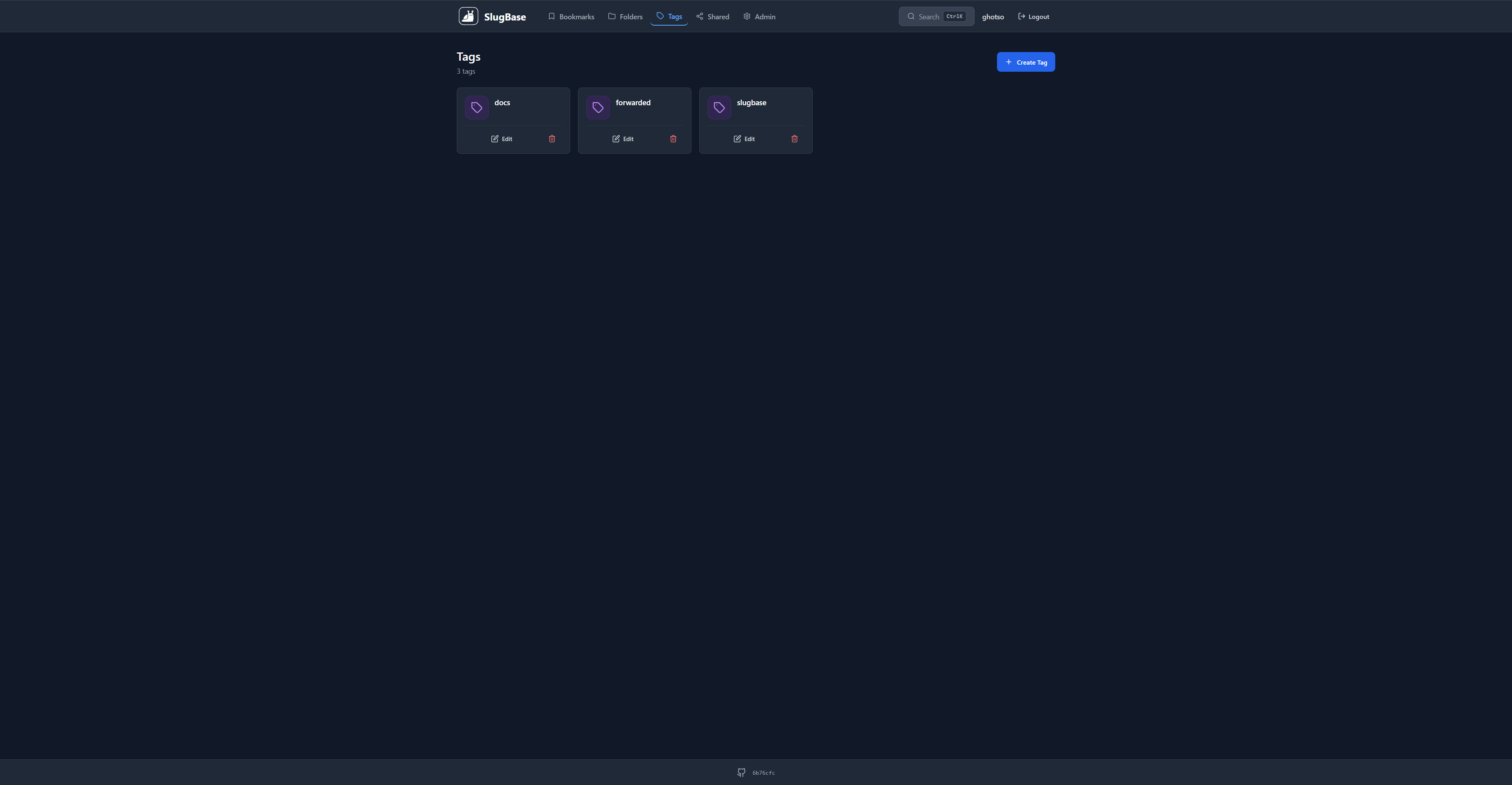
The Tags page allows users to create, edit, and manage tags for organizing bookmarks. Tags provide a flexible labeling system for bookmarks, enabling users to categorize content across multiple dimensions.
Route
- Path:
/tags - Authentication: Required
- Access: All authenticated users
Features
Tag Management
- Create Tags: Add new tags with a simple name
- Edit Tags: Modify tag names
- Delete Tags: Remove tags (with confirmation)
- View Tags: Display all tags in a responsive grid
Tag Cards
Each tag card displays:
-
Header Section
- Tag icon (purple gradient background)
- Tag name (truncated if too long)
-
Actions
- Edit Button: Opens edit modal
- Delete Button: Deletes tag (with confirmation)
Card Design
- Modern rounded cards with hover effects
- Purple gradient icon backgrounds
- Consistent spacing and typography
- Dark/light mode support
- Responsive grid layout (1-5 columns based on screen size, larger than other cards)
User Interactions
Creating a Tag
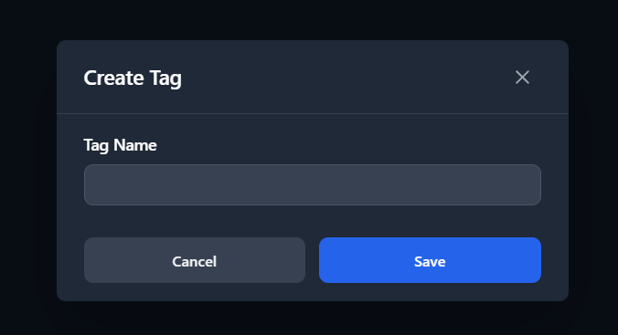
- Click "Create Tag" button
- Enter tag name in the modal
- Click "Save"
Editing a Tag
- Click the edit button on a tag card
- Modify tag name in the modal
- Click "Save"
Deleting a Tag
- Click the delete button on a tag card
- Confirm deletion in the dialog
- Tag is permanently removed (bookmarks keep their tags, but tag association is removed)
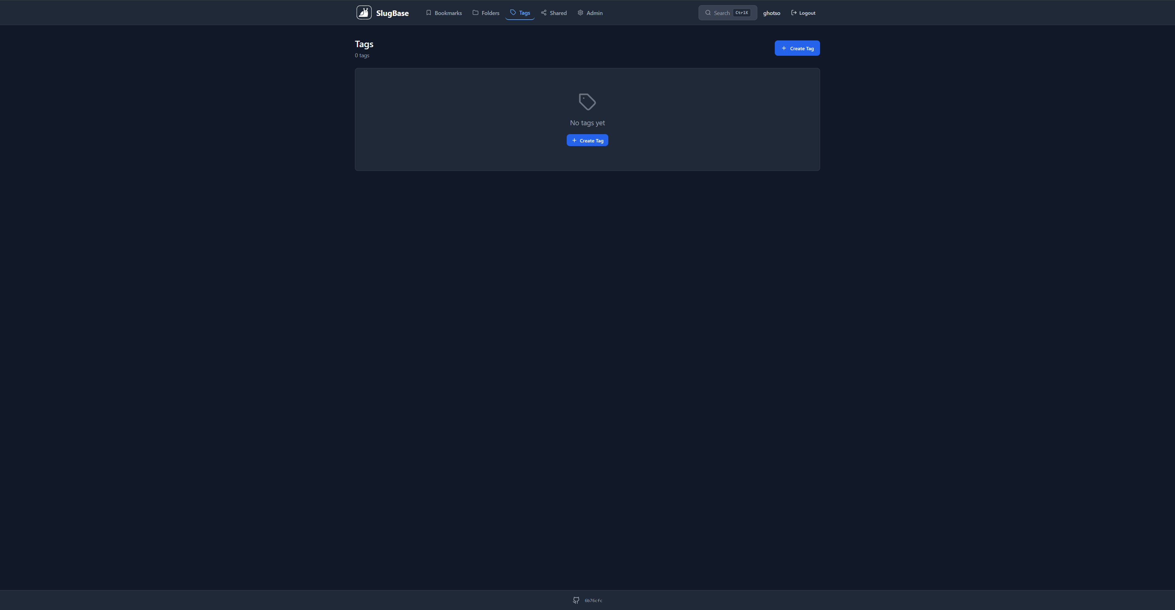
Empty State
When no tags exist:
- Displays tag icon
- Shows empty state message
- Displays "Create Tag" button
- Clean, centered layout
Component Structure
<Tags>
  <Header>
    <Title>
    <Count>
    <Create Button>
  </Header>
  <Tags Grid>
    <Tag Card>
      <Icon>
      <Name>
      <Actions>
    </Card>
  </Grid>
  <Tag Modal>
  <Confirm Dialog>
</Tags>
API Integration
GET /tags- Fetch all tagsPOST /tags- Create new tagPUT /tags/:id- Update tagDELETE /tags/:id- Delete tag
Tag Association with Bookmarks
- Tags are associated with bookmarks through a many-to-many relationship
- A bookmark can have multiple tags
- A tag can be associated with multiple bookmarks
- Deleting a tag removes the tag but not the bookmarks
- Bookmarks are shown on the Bookmarks page with tag badges
Tag Naming
- Tags are unique per user
- Tag names are case-sensitive
- No special restrictions on tag names (alphanumeric and common characters)
- Tags can be renamed at any time
Styling
- Modern card design with rounded corners (
rounded-xl) - Purple gradient icon backgrounds
- Hover effects with border color change and shadow
- Responsive grid:
grid-cols-1 sm:grid-cols-2 lg:grid-cols-3 xl:grid-cols-4 2xl:grid-cols-5 - More columns than folders/bookmarks due to simpler card content
- Spacing:
gap-4, padding:p-5
Related Components
TagModal- Simple create/edit tag formConfirmDialog- Deletion confirmation
Related Pages
Technical Details
- Component File:
frontend/src/pages/Tags.tsx - State Management: React hooks (
useState,useEffect) - Icon System: Lucide React (Tag icon)
- API Client: Custom API client with interceptors
i18n Keys Used
tags.*- All tag-related stringscommon.*- Common UI strings (loading, edit, delete, etc.)
Performance Considerations
- Tags are loaded on component mount
- Simple card structure allows for more columns on large screens
- Grid layout optimizes for different screen sizes
- Efficient re-renders with React hooks
Usage Tips
- Create Descriptive Tags: Use clear, meaningful tag names
- Use Multiple Tags: Combine tags for better organization
- Filter by Tags: Use tag filtering on the Bookmarks page to quickly find content
- Tag Naming Conventions: Consider using consistent naming patterns (e.g., prefixes, categories)